GPT-5.2: The Next Leap in AI Intelligence — Features, Improvements & How It Compares to Google Gemini 3 Parvesh Sandila / December 12, 2025
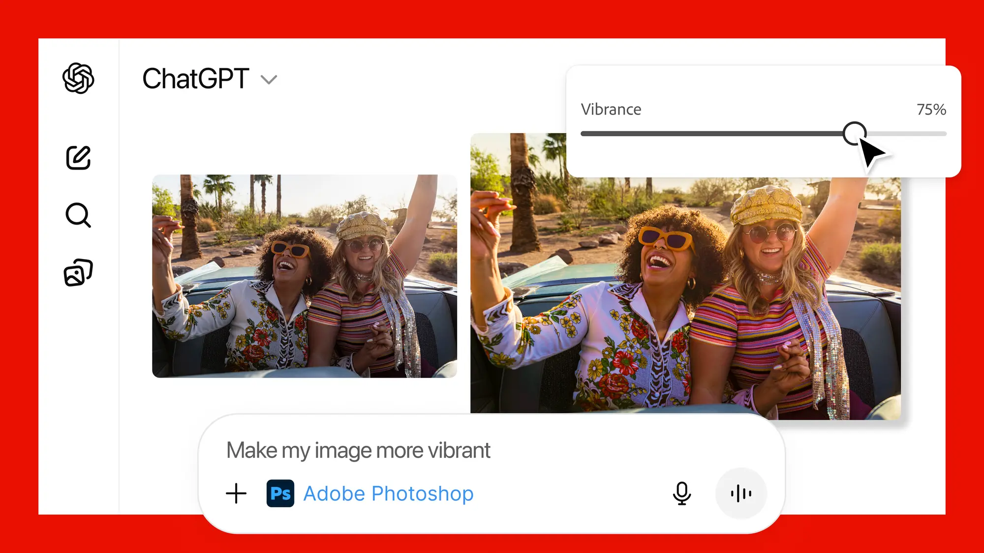
Edit with Photoshop Directly in ChatGPT — Adobe Makes Creative Tools Conversational Parvesh Sandila / December 12, 2025
Nothing Phone 3a Community Edition Review: What Makes This Limited Edition So Special Parvesh Sandila / December 12, 2025
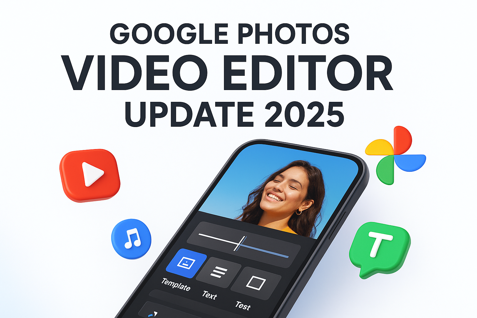
Google Photos Gets a Major Video Editor Upgrade — Templates, Text & Music Added (Dec 2025) Parvesh Sandila / December 11, 2025
Google AI Plus in India: Features, Pricing & How It Compares to Free and Pro Plans Parvesh Sandila / December 10, 2025
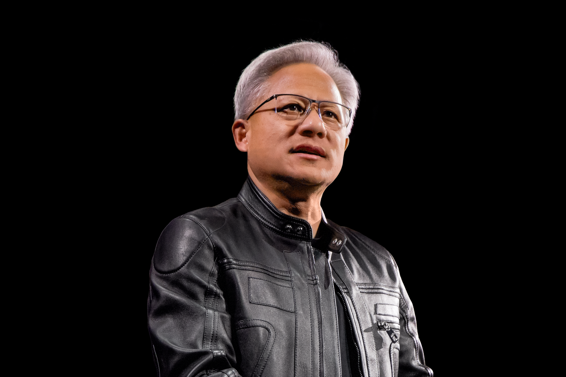
AI Adoption Will Not Be a Sudden Revolution: Jensen Huang Explains How the Future of Work Will Really Change Parvesh Sandila / December 10, 2025
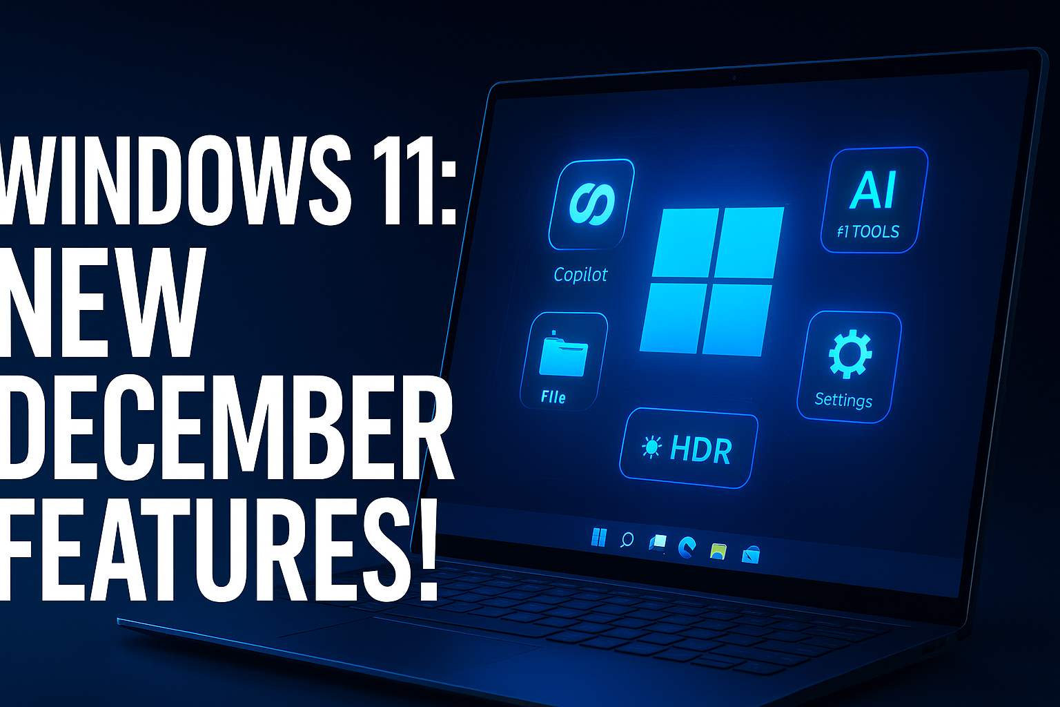
What’s New in Windows 11: 16 Features in the Huge December 2025 Update Parvesh Sandila / December 9, 2025